
Client: Keeping the Record Straight
The accounting company located in Flint, Michigan wanted a simple logo to brand them. The colors maize and blue were chosen because those colors are memorable to those who live in Michigan. A san serif typeface was used so that when the logo is reduced to a smaller size, the integrity of the logo will remain intact.
Logo created using Adobe Illustrator
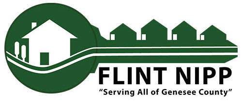
Client: Flint NIPP, Inc. (Flint Neighborhood Improvement & Preservation Project, Inc)
I was hired to redesign the logo of a housing assistance company located in Flint, Michigan. The original was outdated and did not housing industry. The concept of a key with houses was chosen because the company helped clients gain access to resources about home ownership. The ridges of the key are houses. The logo says that Flint NIPP, Inc is the key for access to home ownership in the Genesee county community.
Logo created using Adobe Illustrator
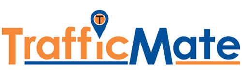
Created while employed at local north Texas tolling company. A logo was needed to brand a traffic monitoring app. The colors where chosen to keep in line with colors that already brand the company. The dot for the letter i was replaced with a common symbol used to represent maps or navigation. The company’s logo was placed in the middle. Although the app was new, elements that their target audience recognized were incorporated into the logo.
Created using Adobe Illustrator
Client: SBC (Social Butterfly Communications)
Logo was created for a small social media company. The color green was chosen because the color represents life, newness or freshness. The lowercase letters sbc were chose to fall in line with the trend of initials used by many companies. Uppercase letters were too blocky and looked cumbersome with butterfly attached to it. Placing the butterfly on the letter b flowed better.
Logo created using Adobe Illustrator