
I was tasked with improving the UX and UI of the dashboards. The original dashboard was created without an UX designer. For this dashboard I used Adobe Illustrator, Adobe Photoshop and Adobe XD to create interactive high fidelity mock-ups of the dashboards. The UI developers used the mock-ups along with style guides to develop the dashboards using HTML, Angular 4, and Javascript. The product owner was very pleased.
SEE ADOBE XD FINAL PROTOTYPE
What is presented below has been modified to protect the identity of the bank.
Original Dashboard
Click to Enlarge
Social Media Style Dashboard
Click to Enlarge
Original Dashboard
Click to Enlarge
Hybrid Social Media Dashboard
Click to Enlarge
Hybrid Social Media Dashboard
Click to Enlarge
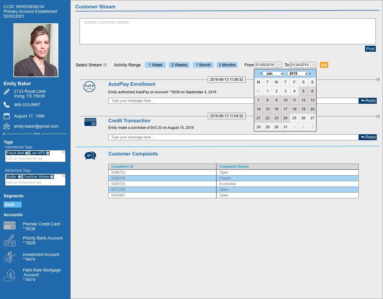
Original Dashboard – No UX designer was used, therefore, this dashboard was pretty bland. The icons were of different sizes and style. Fonts were not consistent and buttons were oversized. Base on the fact that the user would be focused on the right side of the dashboard: transactions, it was decided to reduce the right side. If the user needed to see info about the card user, the user could expand each section as need.
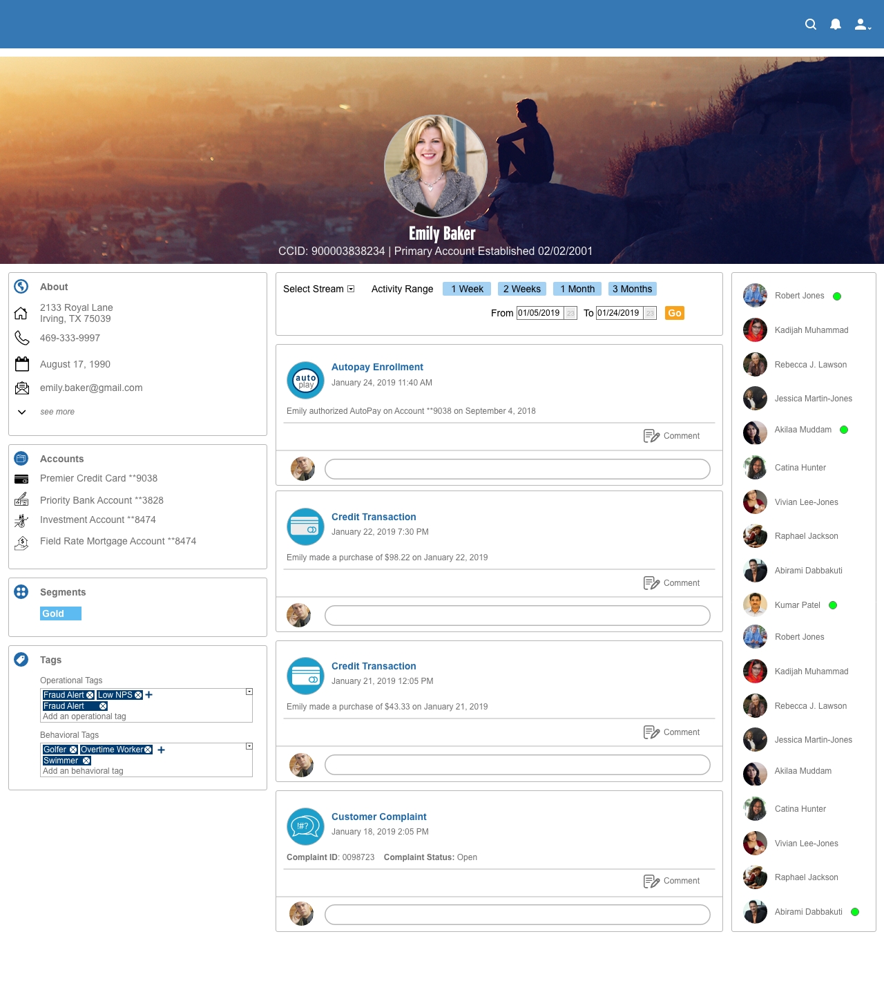
Social Media Style – The product owner felt that the original dashboard looked too “bankish”. In order to make a complete departure from the bank look and feel, a social media style layout was adopted. Elements from the original dashboard were kept but positioned in a way familiar to those who use social media.
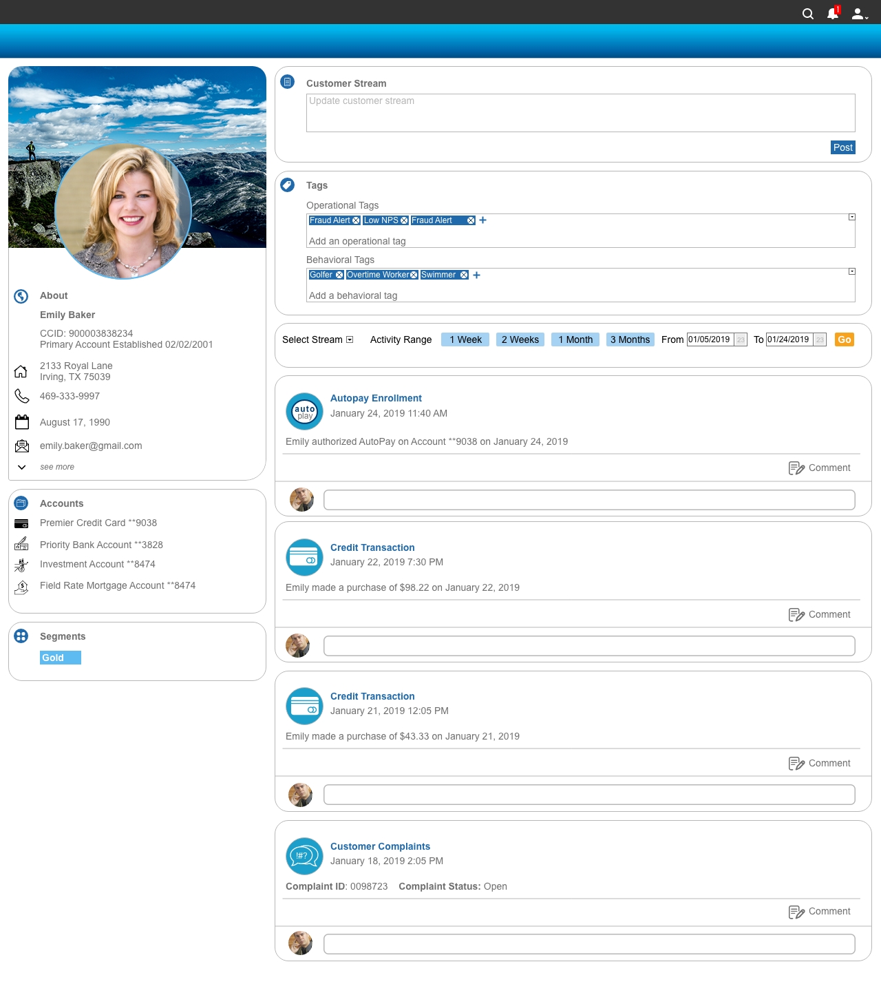
Hybrid Social Media Style Dashboard – The Product Owner felt that the social media style dashboard, looked too much like a popular social media platform. A few elements were removed to reduce the look and feel of a social media platform. This final dashboard uses some elements from the social media style.
Data Analytics Dashboards
Creating dashboards to display data analytics can be difficult at times because you need to determine that best way to tell a story about the data. Creating dashboards for data requires some math and problem solving skills. You need to know which type of graph is most effective at explaining the trend of data. You also have to consider the platform of which the dashboards will shown because based on the platform/technology there may be creative limitations. These two dashboards were created for separate platforms/technologies: angular and tableau.
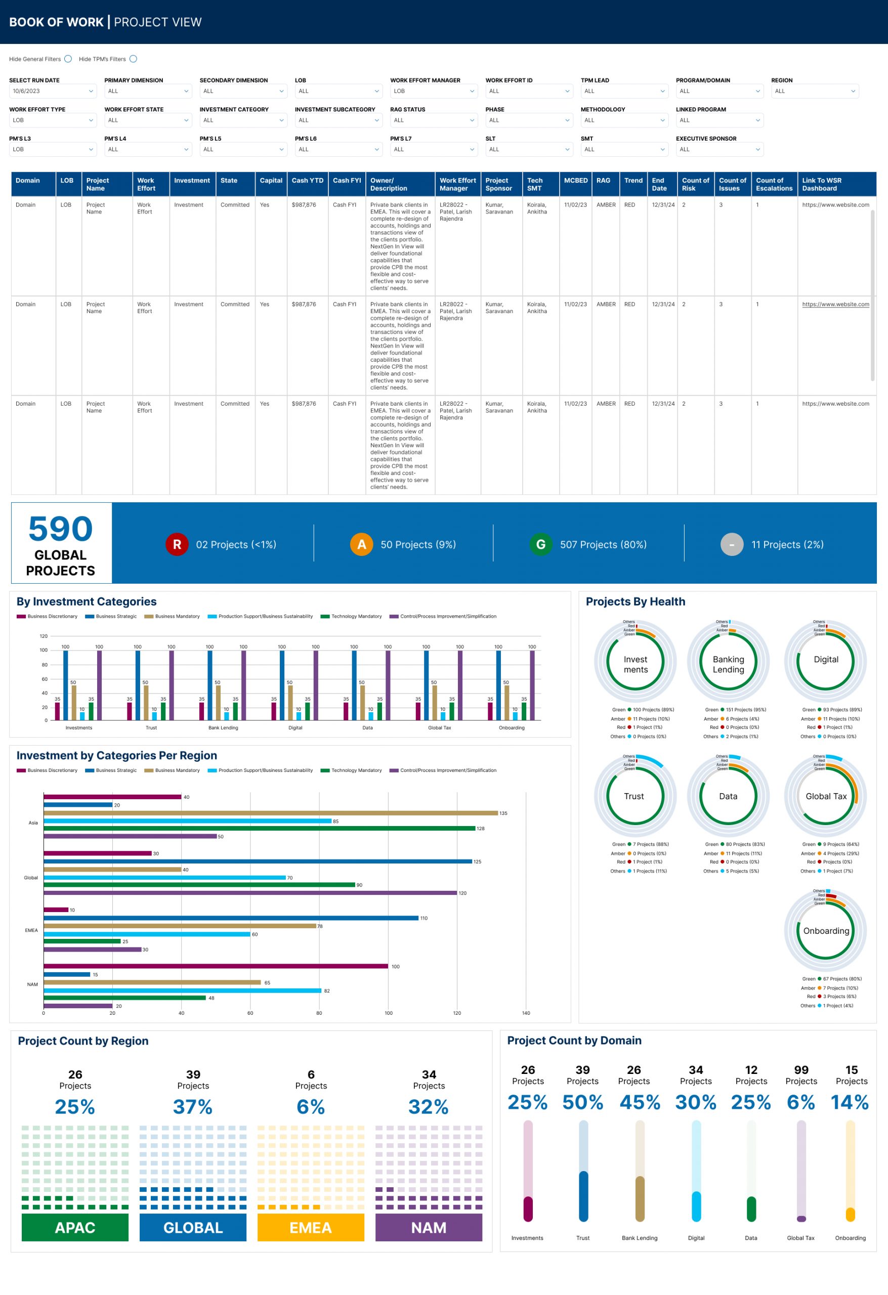
Book of Work Dashboard
Click to Enlarge
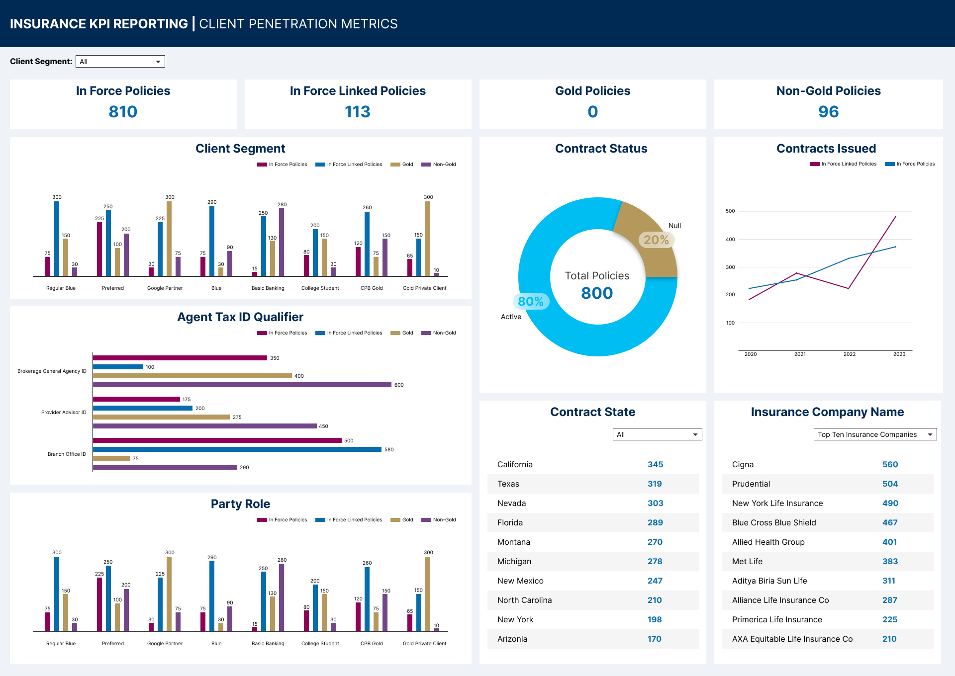
Insurance KPI Reporting Dashboard
Click to Enlarge
Merchant Graph Proof of Concept
This proof of concept was never launched. However, it was fun to create. The purpose of this dashboard was to show/monitor the credit card usage of patrons who paid for services/products at retail/merchant clients. The dashboard also compared credit card usage of similar merchants who are clients of the bank. Customer reviews from Yelp was placed into the dashboard allowing the user to see how patrons felt about the merchant. SEE ABOBE XD PROTOTYPE.
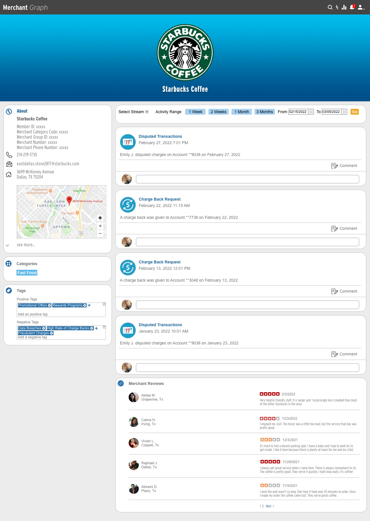
Merchant Graph Home
Click to Enlarge
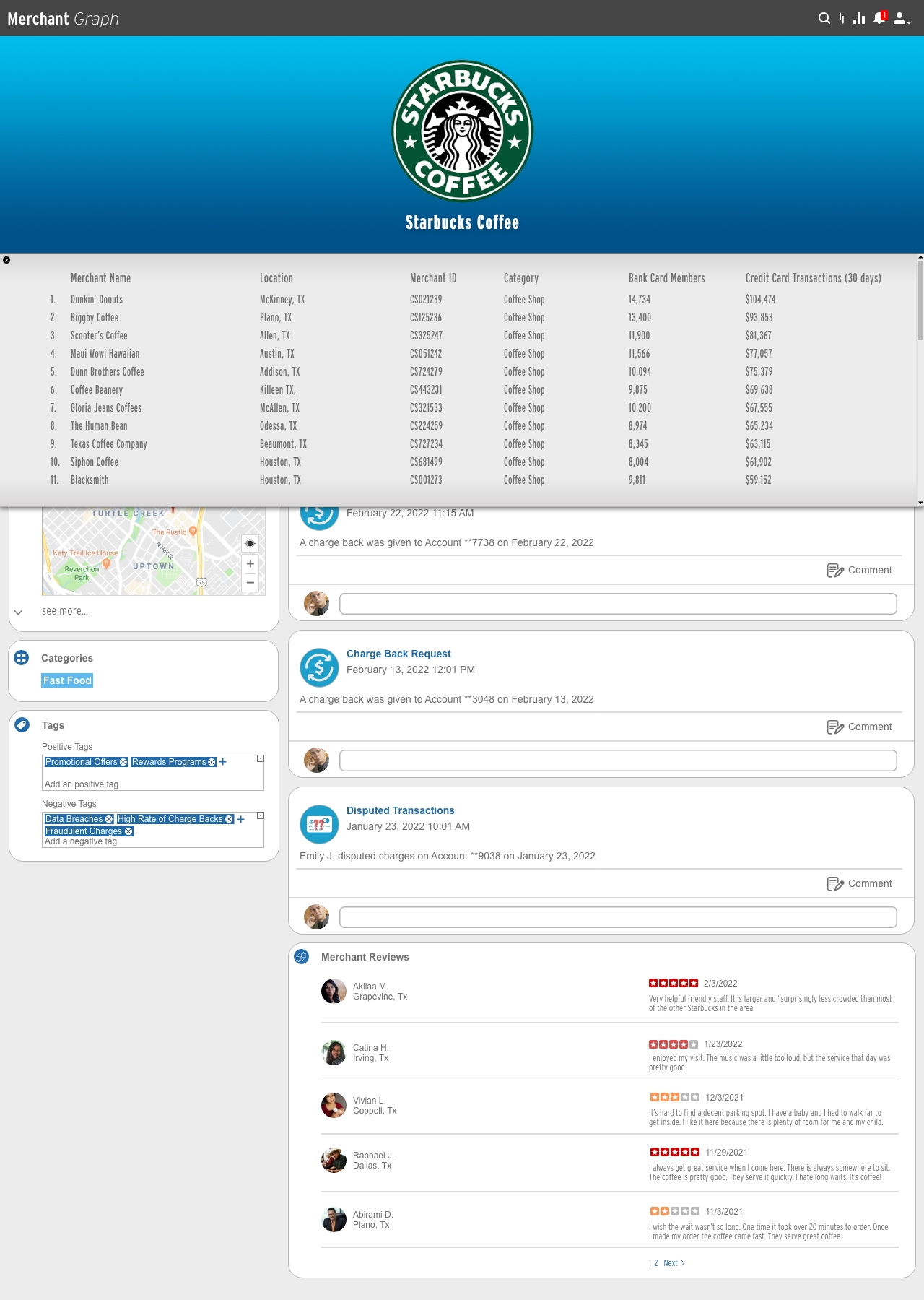
Merchant Graph Scroll
Click to Enlarge